
Climate change is a long-term change in the average weather that a given region experiences. These changes in average weather are usually associated with changes in temperature, precipitation, cloud cover, and wind speed. The Earth’s climate has been changing as far back as we can measure, but the term climate change that we commonly hear today usually refers to recent changes in the Earth’s climate specifically due to an increase in the amount of greenhouse gases in the atmosphere. The increase in greenhouse gases started with the Industrial Revolution when humans started burning coal for factories, electricity, cars, and other machines. People also call it global warming or an increased greenhouse effect.
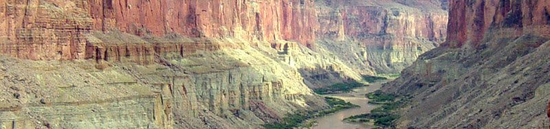
While the impacts from climate change will be felt around the world, from increased temperatures to rising sea levels, some of the most pronounced effects are expected to be right within the Colorado River Basin. The entire streamflow of Colorado River is already allocated to consumptive use, so any reduction will mean shortages within the basin. That’s why it is especially alarming that most recent studies predict significant reductions in snowpack accompanied by reductions in streamflow on the order of 10 – 40%. Almost 85% of the Colorado River’s streamflow originates as snowmelt, and it is with a very high degree of certainty that this will fundamentally change with increased temperatures within the basin. Although this change in snowpack and flow regime is cause for concern in itself, it is the reduction in annual volume of runoff that will be felt by everyone that depends upon Colorado River water.

Unit Outline:
There will be a couple of questions to answer during the lesson, and then at the end we’ll use a hydrology model to see the effect of changes in temperature and precipitation on the snowpack and streamflow of the Colorado River Basin. Let’s get started...

The greenhouse effect is the process in which some of the radiation that leaves the surface of the Earth is trapped by the atmosphere and leads to warming. How does the radiation reach the surface of the Earth, and then get trapped when it tries to leave? That’s because some gases, specifically those called greenhouse gases, are invisible to the Sun’s incoming shortwave radiation, but absorb the Earth’s outgoing longwave radiation. Why is some radiation shortwave and some longwave?
Wein’s Law: In 1896 a German physicist named Wilhelm Wein discovered that the wavelength at which a body emits radiation is determined by the temperature of that body. The equation that describes this, now know as Wein’s Law, is:
Wein’s Law: &lambda = 2897 / T
where, &lambda = Wavelength (in micrometers), and T = Temperature (in degrees Kelvin)
Since the temperature term is on the bottom of the equation that means that the wavelength at which a body emits radiation is inversely proportional to its temperature. The warmer the body, the shorter the wavelength at which it radiates. The colder the body, the longer the wavelength at which it radiates.
The two important bodies that come into play when talking about climate change and the greenhouse effect are the Sun and the Earth. The Sun is important because that’s where we get our energy from, and the Earth is important because it absorbs some of the Sun’s energy (and because it’s where we live). Scientists use a temperature scale called Kelvin, which is equal to Celsius plus 273 degrees. They use this scale so that the coldest temperature that anything can be, called absolute zero, is at 0° Kelvin. We know that the Sun’s temperature is about 6,000° Kelvin, and that the Earth’s temperature is an average of 288° Kelvin. Well then, let’s figure out the wavelength at which the Sun and Earth radiate energy.
Enter the Temperature of an Object: ° Kelvin
So that’s why the Sun’s energy is called shortwave and the Earth’s longwave. The Sun’s is very short at about .5 micrometers, and the Earth’s is long compared to that at 10 micrometers. Well, what difference does that make?
Carbon Dioxide (CO2), Methane (MH4), Ozone (O3), and Nitrous Oxide (NO2) are mostly invisible to radiation at the short wavelengths that the Sun emits at, but they absorb radiation very well at the longer wavelengths that the Earth emits at. This makes them greenhouse gases. Water vapor absorbs outgoing longwave radiation very well, but it also absorbs and reflects some of the Sun’s incoming shortwave radiation. Since on average it contributes to warming the Earth (keeps more heat in than what it keeps out), it is also called a greenhouse gas (and is actually the strongest greenhouse gas). These gases, along with a few others, make the surface of the Earth about 33° Celsius warmer than it would be without them. That’s right, without greenhouse gases and the greenhouse effect, the Earth would be cold and uninhabitable. We’ve known this for a long time; the famous scientists Joseph Fourier and Svante Arrhenius discovered and studied the greenhouse effect back in the 1800s. In the diagram below you can see how the greenhouse effect works.


So that’s the basics of how the greenhouse effect works but let’s look at it in a little more detail. It’s important to know how much each of the gases in the atmosphere contributes to the greenhouse effect. That way, we can better understand what will happen when we increase one of them.
We learned above that the Sun emits radiation at .5 micrometers and the Earth emits at 10 micrometers. The top part of the figure to the right (where it says “Spectral Intensity”) shows the radiation of the Sun on the left in red and the radiation from the Earth on the right in blue. We learned from Wein’s Law that the Sun’s radiation is at .5 micrometers, and that the Earth’s is at 10 micrometers. Can you see this on the figure to the right? It should be on the scale along the top and bottom. So then the question is: which gases absorb at these different wavelengths?
On the bottom of the figure we see the major components of the atmosphere. Water vapor absorbs some radiation on the left side (where the Sun’s radiation is), but absorbs even more on the right (where the Earth’s radiation is). This makes sense since we learned above that it’s the gas that warms the Earth the most. Below water vapor we see carbon dioxide. It absorbs a lot less radiation compared to water vapor, but we can see that it absorbs hardly anything in the sun’s wavelength and it absorbs a good amount in the Earth’s wavelength. This means that if the concentration in the atmosphere increases, it won’t keep out much of the sun’s incoming shortwave radiation, but it will keep in some of the Earth’s outgoing longwave radiation. This is like putting a blanket on the Earth, and will lead to the Earth getting a little bit warmer. We can see the same relationship with oxygen and ozone, methane, and nitrous oxide. They all absorb better in the Earth’s outgoing longwave wavelength than in the Sun’s incoming shortwave wavelength. This means that if we increase the concentrations of these, they’ll also cause the Earth to warm.

The problem is that since the Industrial Revolution humans have been adding a lot more greenhouse gases to the atmosphere than what occurs naturally. We’ve done this mostly through burning coal and petroleum in factories and automobiles. We’ve also cut down a lot of trees that would normally have taken some of the CO2 out of the atmosphere. Burning fields and waste has added even more CO2 to the atmosphere. See the figure on the right for a summary of annual greenhouse gas emissions.
While all the greenhouse gases are important, the one that people usually talk about when they talk about global warming is CO2. This is mostly because we’re putting more CO2 into the atmosphere than any of the other gases. The graph on the bottom right is the most famous graph in all of science. It shows the atmospheric CO2 concentration from 1958 through 2004 measured at the Mauna Loa observatory in Hawaii. The atmospheric CO2 concentration was about 270 parts per million by volume (ppmv) before the industrial revolution, and today it is around 385 ppmv, an increase of over 40%.
Below we can see how much different gases are responsible for warming the Earth. Water vapor contributes the most, but we are not directly adding more of this to the atmosphere. Water vapor is, however, very important because a warmer atmosphere can hold more water, so as the Earth starts to heat up, they’ll be more moisture in the air, which will lead to even more warming. This is called a positive feedback, and we’ll talk more about it below.
That's the basic physics of climate change. Now let's look at some observations from around the globe for the last 100 years and see if what we'd expect is true.

The effect of putting greenhouse gases in the atmosphere and warming the Earth is compounded by various feedback processes. Some feedbacks will be positive, meaning they will cause more warming, and some feedbacks will be negative, meaning that they will cause cooling. How the different feedback processes will play out is one of the largest sources of uncertainty for scientists. Here is an example of a couple feedbacks.
The polar ice caps reflect the incoming solar radiation back out to space, so melting the ice caps means the Earth will now absorb this radiation. This will lead to more warming, which will then melt more of the ice caps, which will in turn lead to even more warming. This is very strong positive feedback.
Warm air can hold more water vapor than cold air, and we saw in figure 2 that water vapor is the most effective greenhouse gas. This means that as the planet warms, there will be more water vapor in the air, which will in turn lead to more warming, again putting more water vapor into the air. There is some uncertainty about this feedback though, since water vapor that is in the upper atmosphere helps reflect incoming solar radiation back out to space.
The oceans act as giant heat conveyor belts, and changing the climate may change the circulation patterns of the ocean. Scientists are not sure if this will be a positive or negative feedback.
Scientists believe that a warmer Earth will cause terrestrial ecosystems to lose carbon to the atmosphere, thus contributing to more warming. Warmer temperatures are also predicted to lead to more forest fires that will also put more CO2 into the atmosphere

As we’d expect from what we’ve learned above, the Earth’s average temperature has increased since the start of the Industrial Revolution. We can see in the figure to the right that the average temperature of the Earth is about 0.8 °C warmer than it was in the mid-1800s. This does not mean that every place on the surface of the Earth is exactly 0.8 °C warmer than it was in 1850; some have gotten even warmer than this, but some places have also got colder. That’s one of the complicated things about climate change: we know from physics that the average temperature should go up, but no one place on the Earth is average. The effect of having more CO2 in the atmosphere is going to be different depending on where you are. We can see in figure below where most of the warming has occurred. The high latitude areas over land have the most warming, while places over the ocean and Antarctica have very little warming (even cooling). In the Colorado River Basin the average temperature is 1.4 °C warmer than it was in the early 1900s.


Since different regions experience different year to year weather, scientists often look to use other data that will show the more long-term climate trend. Glaciers are a very good proxy data source for this. If the terminus (end) of the glacier is moving down the mountain to a lower elevation, or if the glacier is getting thicker, it usually means that the average temperature of that area is getting colder. If the glacier is retreating uphill, or if it is getting thinner, that’s because the average temperature is getting warmer.
The figure to the right shows the retreat of the Helheim Glacier in Greenland over the period from 2001 to 2005. In this short period, the terminus of the glacier retreated five kilometers. The figure in the bottom left shows changes in glacier thickness between 1955 and 2005, where we can see that the average change is a decrease of 14 meters of thickness.
Sea level rise can also be used as an indicator of climate change since we’d expect the ocean to rise with warmer temperatures. This would happen because the ocean would be warmer and would expand (warm water is less dense than cold water) and because ice that was on land (most notably on Greenland and Antarctica) would melt and runoff into the ocean. We can see in the figure below that sea level has been rising over the last century.

Scientists rely on computer models to try and predict what the climate will be like in the future. These models are called Global Circulation Models, but people often refer to them as GCMs for short. They divide the Earth into grid cells and simulate out hundreds of years using equations to represent the physical processes that take place in the atmosphere, ocean, ice, and land. GCMs have an input for how much energy the Earth gets from the sun, and then they simulate what the Earth does with this energy. Another input to GCMs is the composition of the atmosphere, and from this the models know how much of the Earth’s outgoing longwave radiation is absorbed by greenhouse gases. By increasing the amount of greenhouse gases in the model we can learn how the Earth would respond if this actually happened.

There are lots of organizations that have made GCMs (by writing lots of computer code). Two of the most critical outputs from these GCMs is future temperature and precipitation in different parts of the globe. All GCMs predict the Earth will get warmer because of the greenhouse gases humans are putting into the atmosphere, but they disagree about exactly how warm that will be. Changes in precipitation are more difficult for GCMs to predict, and some of the models disagree with each other about where these changes will occur. These differences in projections are because the GCMs use different equations to represent the earth’s physical processes, but also because of the uncertainty in feedbacks and in exactly how the earth will respond to increases in greenhouse gases.

How much the Earth will warm in the future depends on the amount of greenhouse gases we put into the atmosphere. Unfortunately, we don’t know exactly what global emissions will be like in the future, and this is another source of uncertainty in trying to predict how the climate will change. To try and work with this uncertainty, the Intergovernmental Governmental Panel on Climate Change (IPCC) had developed what are called emission scenarios. The emission scenarios are divided into groups that correspond to different development pathways. The highest and lowest emission scenarios, A2 and B1, respectively, are often looked at to give a range of what may happen. More information on the emission scenarios is below, and the projected change in atmospheric CO2 concentration for each emission scenario is shown on the right.
A2 Emission Scenario: a very heterogeneous world with continuously increasing global population and regionally oriented economic growth that is more fragmented and slower than in other scenarios.
A1B Emission Scenario: a future world of very rapid economic growth, global population that peaks in mid-century and declines thereafter, and the rapid introduction of new and more efficient technologies. It is based on the assumption that improvement rates apply to all energy supply and end-use technologies.
B1 Emission Scenario: a convergent world with the same global population as in the A1 storyline but with rapid changes in economic structures toward a service and information economy, with reductions in material intensity, and the introduction of clean and resource-efficient technologies.
Scientists use these emission scenarios with the Global Circulation Models to try and figure out how the Earth will respond to a given increase in CO2. We can see in the figure on the bottom left that the A2 emission scenario has the greatest amount of warming associated with it, and that the B1 scenario has the least warming. On the bottom-right is a map that shows the warming is unlikely to be uniform over the globe, but will be greater over land and at high latitudes, and less over the ocean. Just like in observations over the past 100 years, the Colorado River Basin is expected to warm more than the average amount, with its range of projected temperature increase between 3 °C and 5 °C. It is important to note that although the climate models don’t all predict the same amount of warming, they all do agree that the Earth will get warmer because of the increase in greenhouse gas concentrations.

Most models predict that precipitation will increase in high latitudes (in both the Northern and Southern Hemisphere), decrease in the range from 10 degrees to 40 degrees latitude, and increase over the equator. The variability and intensity of precipitation is also expected to increase with a warmer climate.
The figure below presents results for the average of 12 climate models in December through February precipitation under the A1B emission scenario. White areas are where less than 66% of the models agree on the sign (positive or negative) of the precipitation change, and dotted areas are where greater than 90% of the models agree on the sign of the change. The values below are for 2090-2099 relative to 1980-1999.

High northern latitudes are expected to see significant increases in runoff, while regions that are already generally dry are expected to see decreases in runoff. The decrease in runoff in these already dry regions (notably southern Europe, the Middle East, and southwest North America) is expected to exacerbate current stresses on water resource systems.
The figure below presents results for the average change in runoff for 12 climate models under the A1B emission scenario. White areas are where less than 66% of the models agree on the sign (positive or negative) of the runoff change, and thatched areas are where greater than 90% of the models agree on the sign of the change. The values below are for 2090-2099 relative to 1980-1999.


From the temperature, precipitation, and runoff figures, we can see that the expected changes for the Colorado River Basin are a 3 – 4 °C temperature increase, not much change in precipitation, and a 15 – 20% decrease in runoff. This significant decrease in runoff from not much change in precipitation is due to more water being lost to evaporation in a warmer climate.
In the Hydrology Unit we learned about the hydrology models which are used in climate change studies. One of these hydrology models was used on the Colorado River Basin with output from 11 different climate models, from which the averages are presented below (Christensen and Lettenmaier 2007). The figure to the right is also from this same study, but shows result from one climate model only (Max Planck Institute). The top two plots show projected changes in temperature and precipitation through the year 2100, while the bottom two plots show how these will change throughout the year.
| Year | Δ Temp. (°C) | Δ Precip. (%) | Δ Runoff (%) |
| 2010-2039 | 1.3 | 1 | 0 |
| 2040-2069 | 2.1 | -1 | -7 |
| 2070-2099 | 2.7 | -1 | -8 |
| Year | Δ Temp. (°C) | Δ Precip. (%) | Δ Runoff (%) |
| 2010-2039 | 1.2 | -1 | -1 |
| 2040-2069 | 2.6 | -2 | -6 |
| 2070-2099 | 4.4 | -2 | -11 |
Two other studies of the Colorado River Basin that were done recently showed even greater runoff reductions. One study showed a 10 – 30% decrease (Milly et al. 2005), while the other showed a 45% decrease (Hoerling and Eischeid 2007). Even though there is a significant range in these projections, all project streamflow decreases, and it is important to note that even the most modest reduction of 10% would cause water shortages in the Colorado River Basin since all of the water is already allocated to consumptive use.

Changing the temperature and precipitation in the basin will lead to changes in snowpack and runoff. In the Hydrology Unit we learned that the Colorado River is what is called a snowmelt dominated basin, meaning that winter precipitation accumulates as snow and then warmer spring temperatures melt this snow, causing most of the runoff to occur in the late spring. If we increase the temperature, then some of the precipitation that previously fell as snow in the winter will now fall as rain. This will cause higher winter runoff (since the rain turns directly into streamflow) and a decreases in the snowpack. This decrease in the winter snowpack means that the runoff from the spring melt will be smaller. The higher temperatures also mean that this snow will melt sooner, and hence the runoff will shift to earlier in the year.
The first figure to the right shows the simulated natural hydrograph at Imperial Dam, AZ. The black line is an average for the period 1950-1999, and the colored lines are the streamflow projections using the temperature and precipitation predictions from different GCMs. Although the hydrographs are different, we can see that they all show that we will have higher winter streamflow in the future, a much earlier and smaller peak flow, and much lower late summer flows. Scientists spend a lot of time looking at the variability between streamflow projections, but notice that all of the hydrographs show overall decreases.
The figure to the far right shows how the snowpack in the basin will change in the future. This type of plot can be confusing, so here is an example of how to read it.
For the period from 2070-2099 for the A2 emission scenario (solid red line on the figure), the data point that has a black circle around it shows that at an elevation of 2,200 meters (y-axis), there would only be 35% (x-axis) as much snow as there was in the period from 1950-1999.
Many studies have investigated what these changes in climate will mean to the managed water resources of the Colorado River Basin. Most of these studies use basin models like the Basin Model to see what will happen in the future if we have different streamflows than in the past, and although the models vary widely, all the studies have shown significant reductions in system storage, increases in shortages, and reduced hydropower generation. One study predicted that Lake Mead will be drawn so low that it won’t be able to generate hydropower 50% of the time by 2021 (Barnett and Pierce 2008). At the end of this lesson you’ll be able to generate your own climate scenarios, and then run the Basin Model to see the water resource impacts of these changes, but before we do, let’s look at results from one recent study.

The figure to the right shows results from a study (Christensen and Lettenmaier 2007) that used 11 climate models under two emission scenarios (A2 & B1), a hydrology model to get changes in runoff from the output of the climate models, and a reservoir model to analyze what the changes in runoff mean for water resources in the Colorado Basin.
The black columns are the averages for the period from 1950-2000, and the turquoise are for the period 2070-2099 under the A2 emission scenario. We can see that as the streamflow decreases (Imperial Natural Flow) the amount of water in the reservoirs decreases (Avg. Storage), releases from the reservoirs decrease (Glen Canyon Release), and hydropower generation decreases (Avg. Energy). The columns on the far right of the figure show that shortages will happen more often and at a greater amount in the future than in the past.